Greetings!
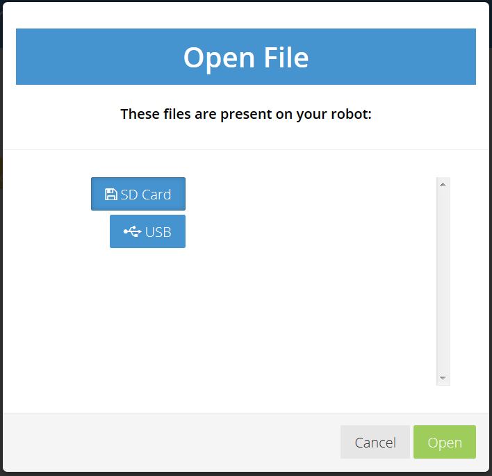
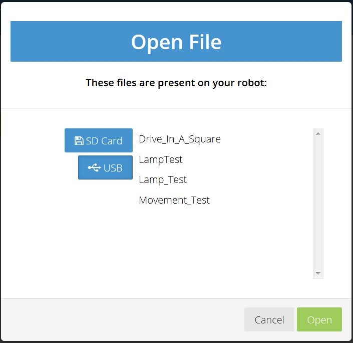
Please note the following screen-shots:
This is the “open files” dialog pointing to the SD card storage.

This is the “open files” dialog pointing to the USB card storage.

Except for the presence of files within the second screen-shot, there is no way to tell which is the selected item.
More important than that, (looking at the first screen-shot), there is no way to tell by direct visual inspection that there are two options being offered rather than just two labels for what appear to be rows in a table.
Suggestion:
Please make these into either tabs or some kind of menu-bar across the top so that the user knows that a selection is being made - and! - make the selected item visually distinct so that the user knows exactly what has been selected.
Thanks!
Jim “JR”