Greetings!
Executive Summary:
-
The existing JupyterLab interface is confusing, even for expert computer users and programmers.
-
There is a very easy fix: Re-implement the “classic” notebook interface. If all the eye-candy is important, then the features of the classic interface need to be imported into the new one.
First of all, I really like the GoPiGo robot. It’s interesting and “chewy” in ways that I haven’t experienced since I started hacking a 16k Atari 600 XL to increase it to 64k.
Unfortunately, the user interface for the JupyterLab doesn’t help.
Don’t get me wrong. I appreciate the fact that the DexterOS environment is designed for rank beginners who want to play with robotics without needing a PhD in Rocket Science. However, the number of things you can do in bloxter is relatively limited and the user is encouraged to migrate to Python as soon as possible.
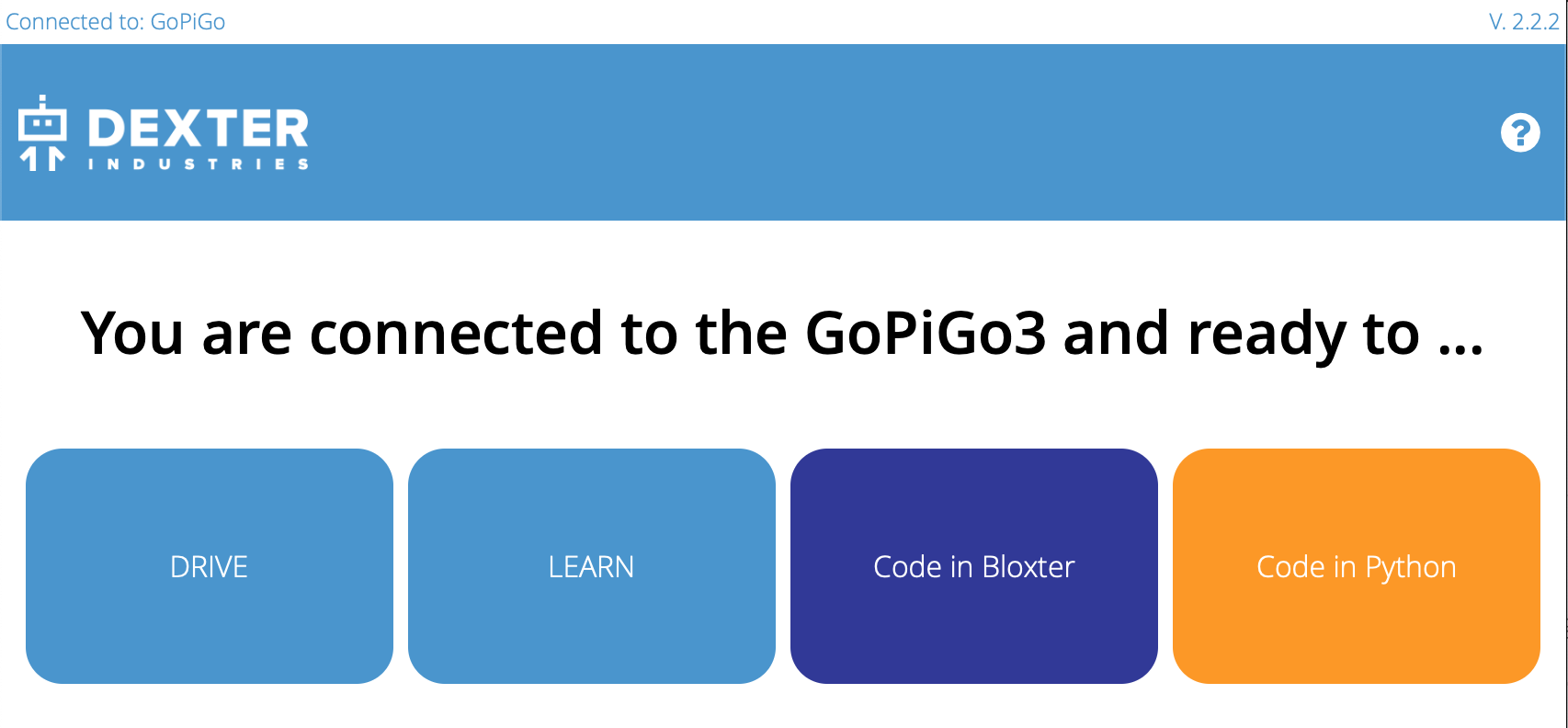
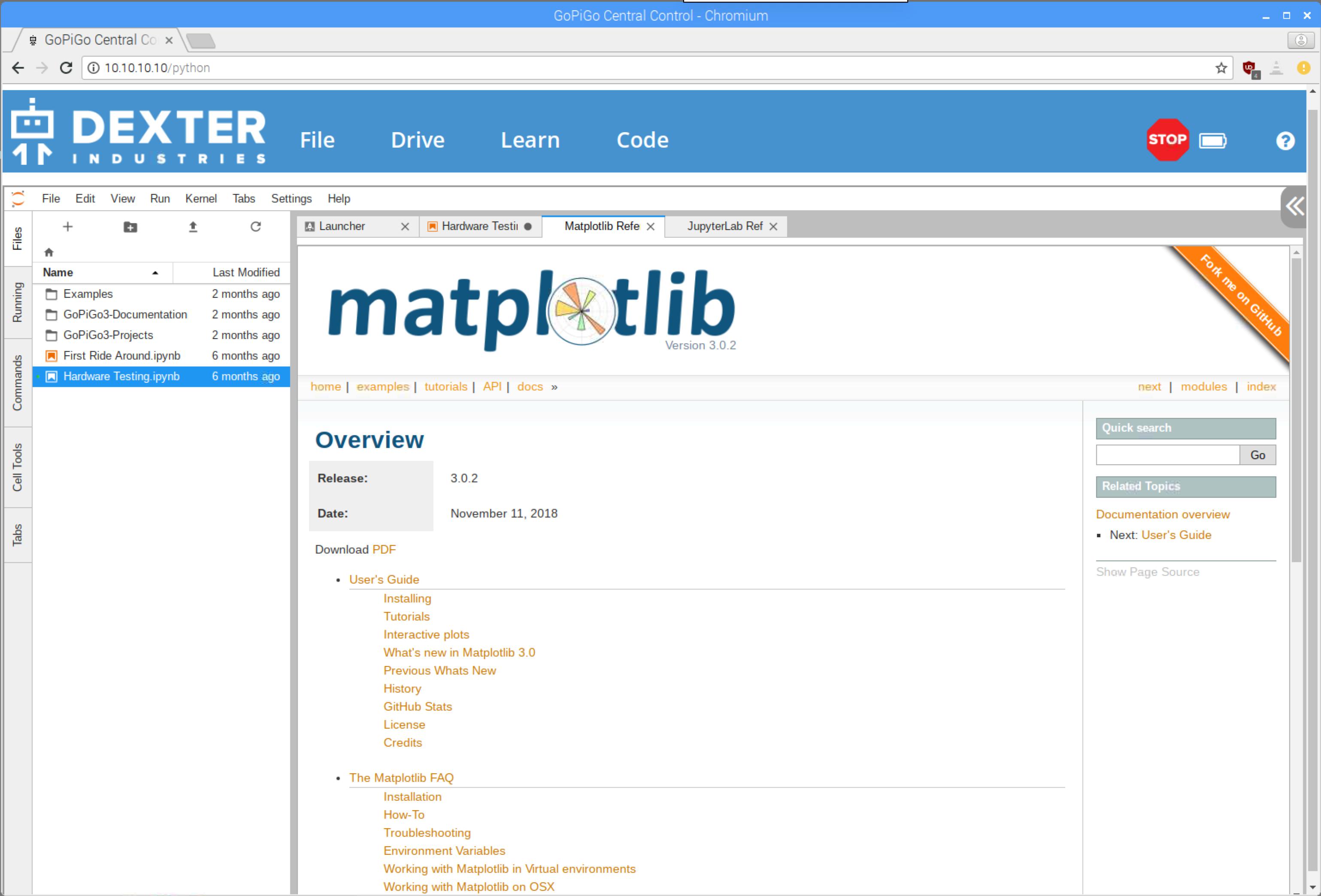
Moving to the “Code in Python” pages, you are immediately confronted with the JupyterLab environment, and there are a number of immediate issues that confront the user:
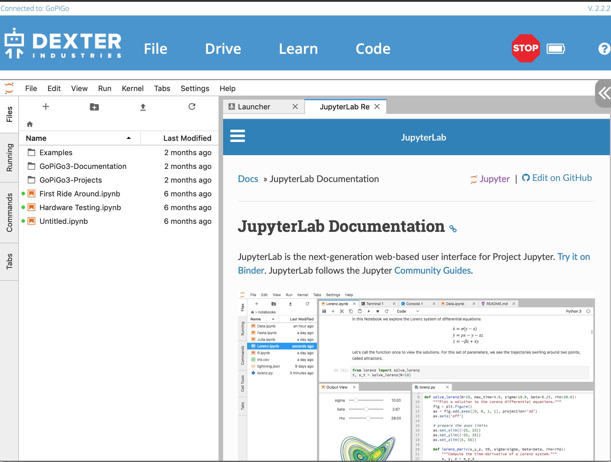
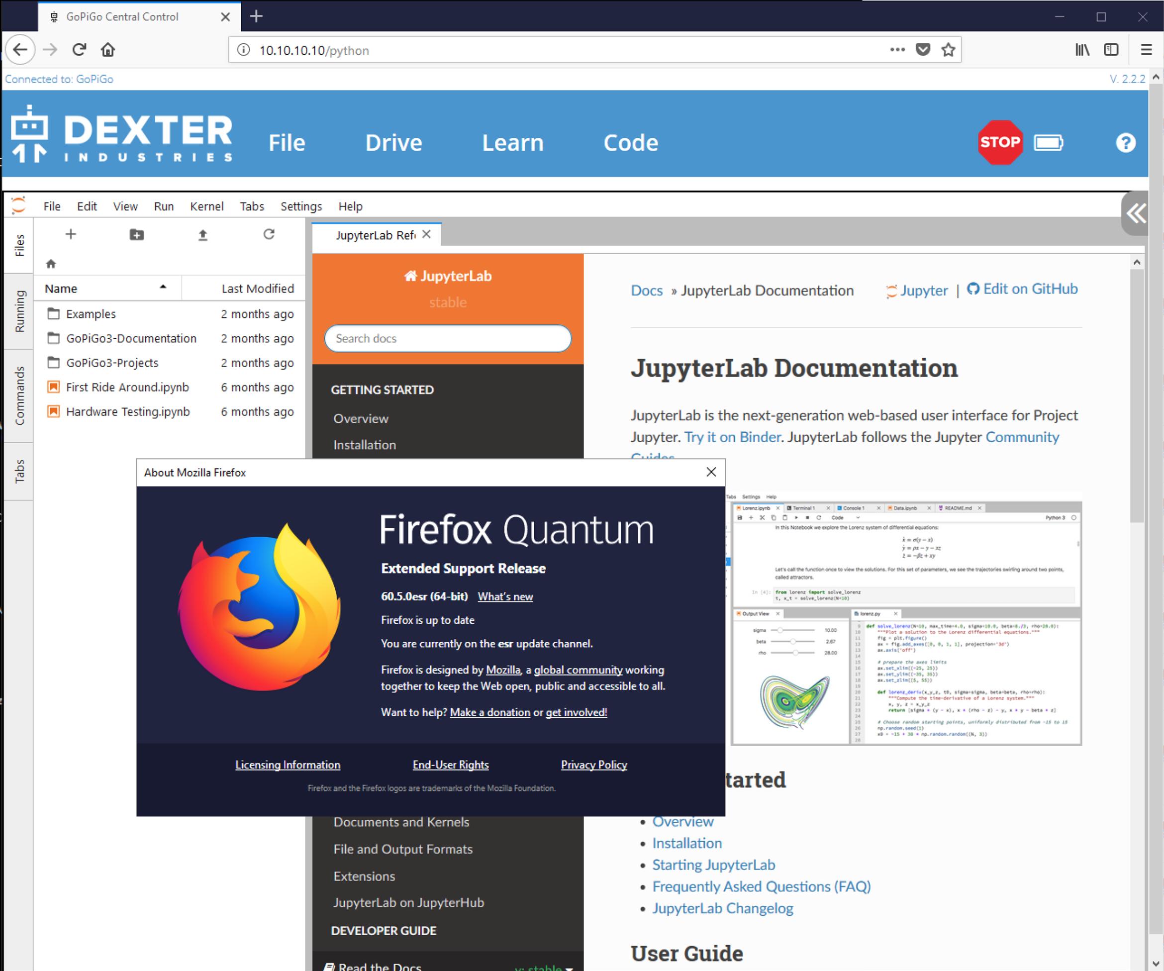
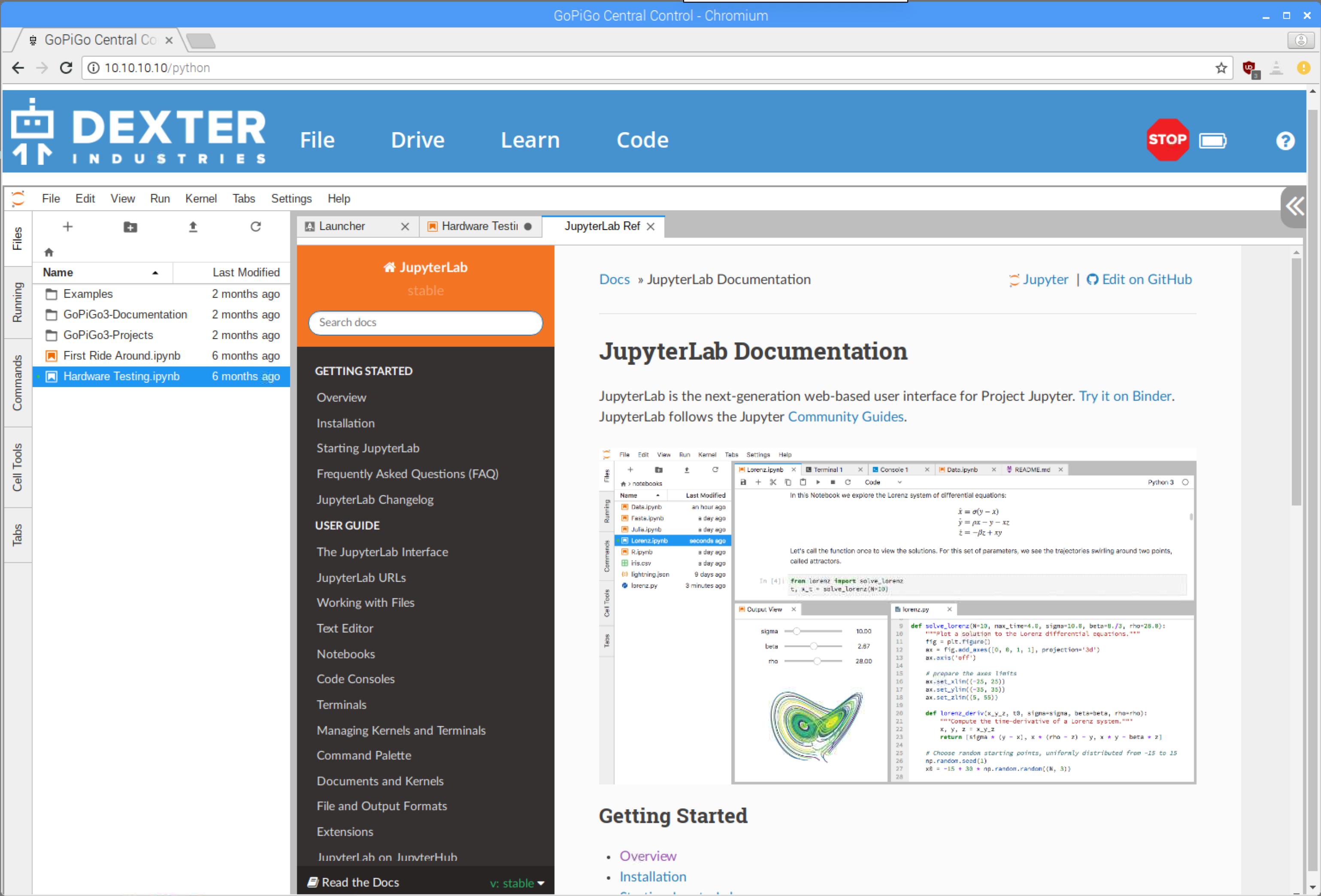
- Some of the JupyterLab environment’s content depends on resources that cannot be accessed while in the DexterOS environment.
Also note:
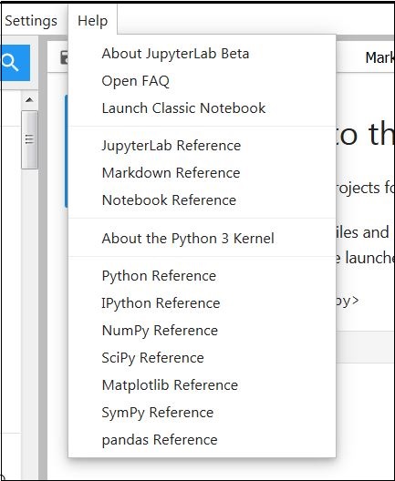
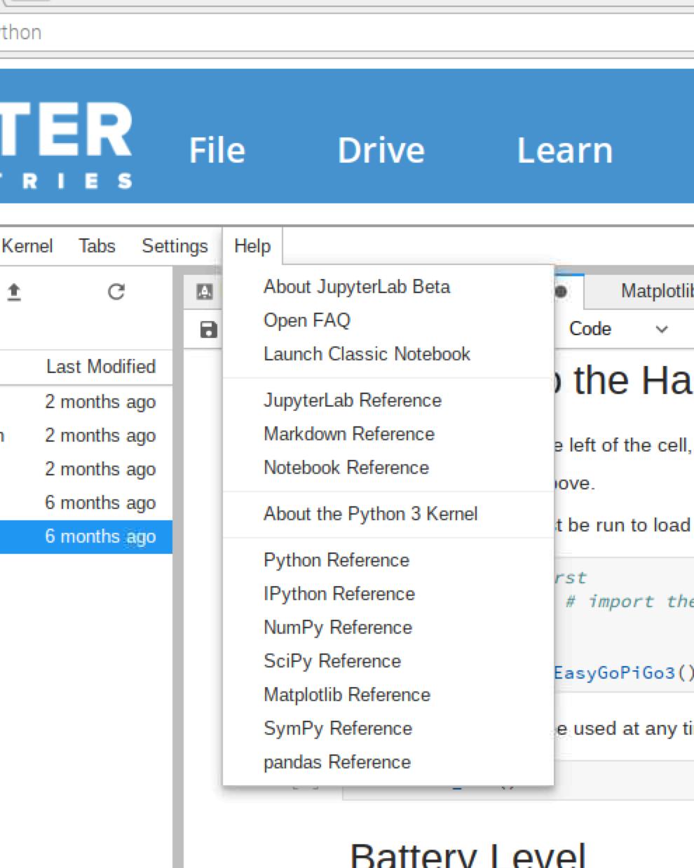
Note that every single “reference” item on this menu is a dependency that is unreachable.
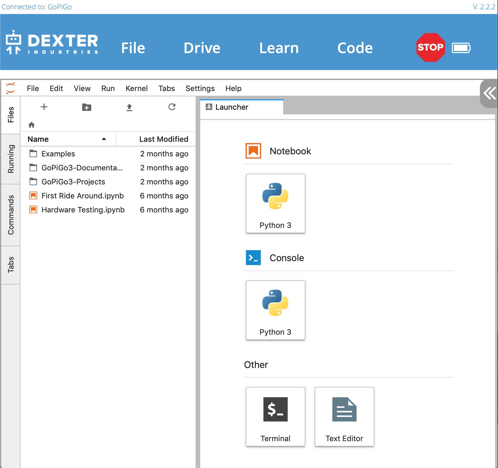
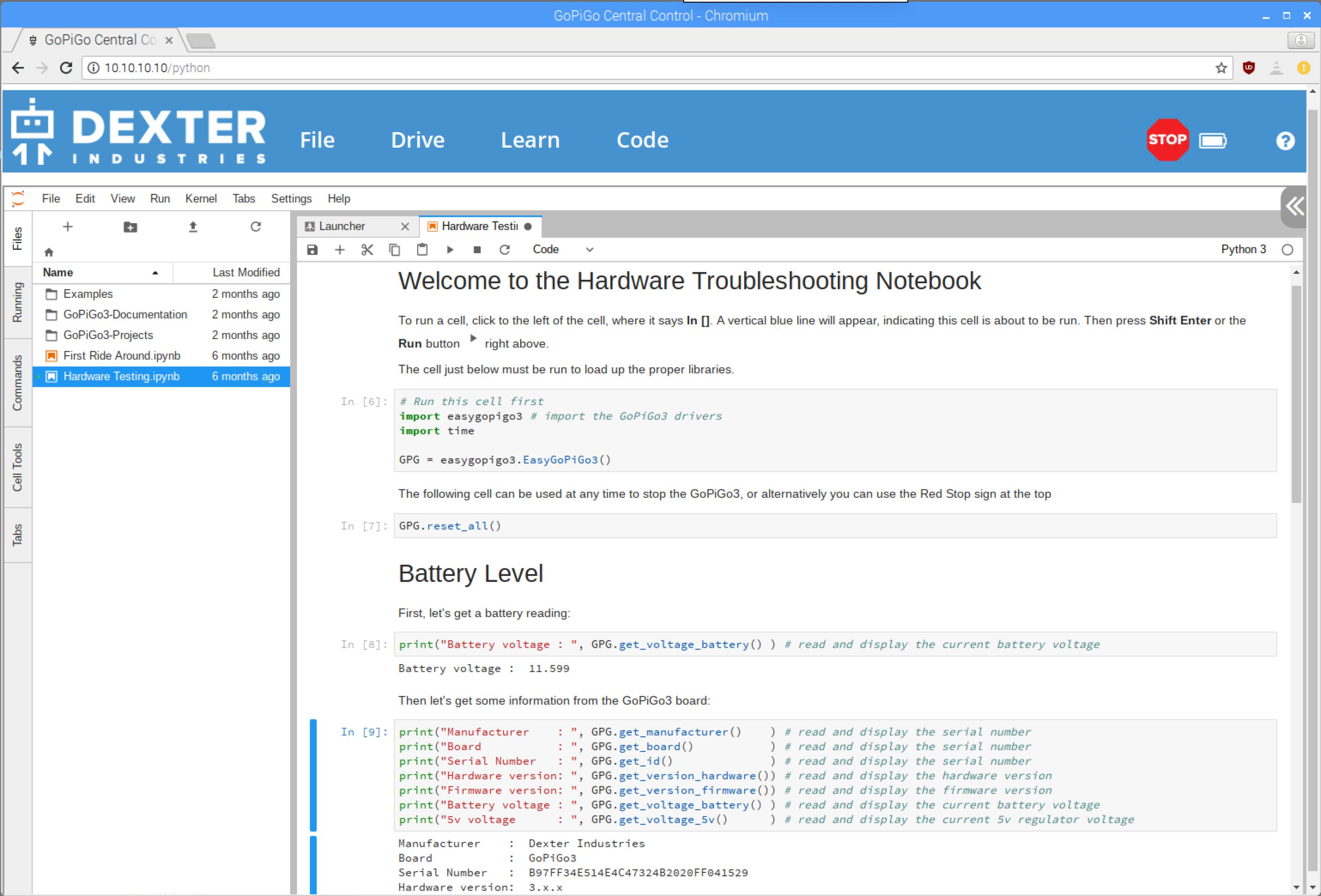
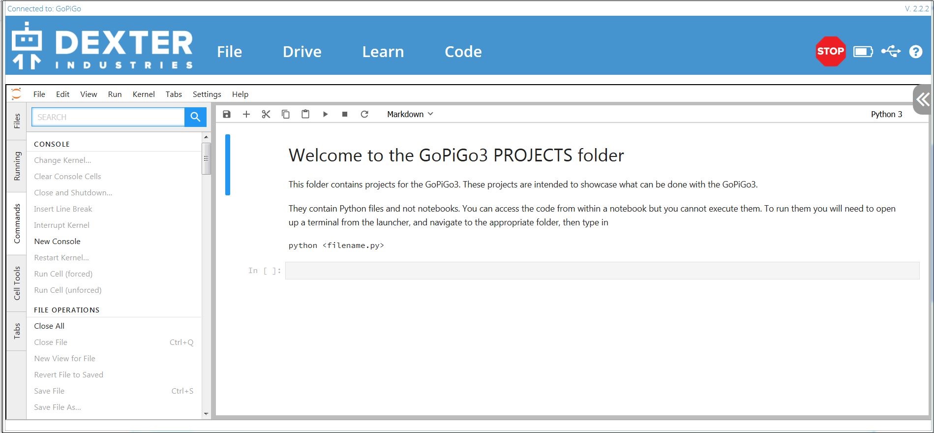
- When the user first enters the JupyterLab interface, the first thing he is confronted with is a page that says he can’t do anything there.
Viz.:

As I see and understand it, you create "notebooks" that supposedly contain programs that are a part of a project that the "notebook" encapsulates.
However, this first page is confusing.
-
Where are the “notebooks”?
-
Where are the “programs”?
-
Where is this “the Launcher” that I am supposed to use?
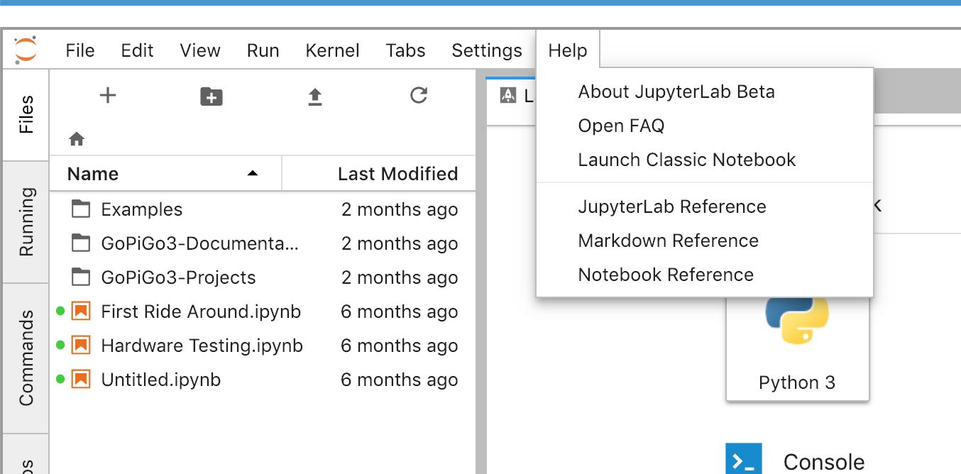
Further investigation discloses that there is a "classic notebook" style which solves 99.99999....99999% of the problems. Opening the help menu drop-down in the new-style JupyterLab shows an entry called "Launch Classic Notebook"
Viz.:
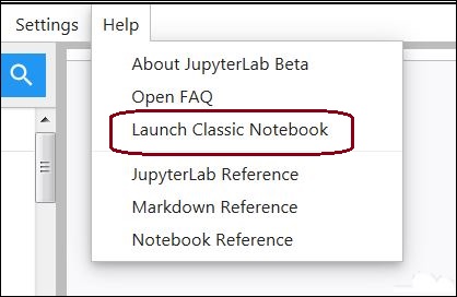
Once you launch the classic notebook, you are given a page that is much easier to use.

Here you have access to a folder-tree that makes more sense, access to examples and USEFUL documentation along with two programs that, (IMHO), should be on the front page of the DexterOS web page:
- The Hardware Test program.
- The First Ride Around program.
Both of which provide important and possibly essential ways to validate the basic build of your 'bot before you go crazy contacting support.
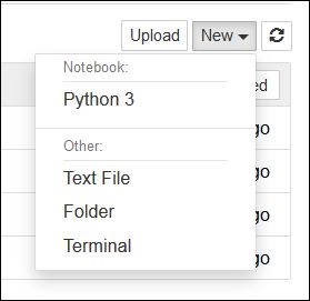
Even the "New" button is useful, providing easy access to a terminal window, along with the ability to create a new folder or file.
Summary:
If I could ask one thing of the maintainers that would make everything so much easier it would be to revert back to the old-style JupyterLab interface.
Jim “JR”
